

How to decorate your home with bright colour
Using bright colour in the home is so often bypassed due to fear of getting it wrong. Many people settle for a much softer colour scheme in their interior design ideas, or limit the amount of bright colour they use as a result.
Since I am a fan of brights, I thought I would give you some tips on how to get the best out of using them. Hopefully these points will give you some confidence to take the plunge and go brighter with your home decor….
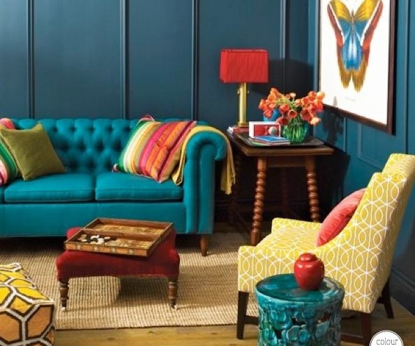
Is the chosen colour right for you?
You need to feel comfortable with the colour scheme you choose. Don’t be trend driven or copy something you have seen, if it isn’t really you. Make sure you choose a bright colour or colours that you actually like. There is no right or wrong here. You need to live with this decor though, so you don’t want to end up hating it after completion. Once you have picked the right colour for you, make it work into the room by considering the following….
Will the colour or amount of colour work for the room?
Ensure the colour is also going to have the right effect on your mood and intentions for the space. Think about the function and desired feel for the room. Don’t over stimulate or underplay colour in the wrong space. For example, a bedroom should be a calming place, so don’t go over the top with bright colour in here. You don’t want to feel uneasy when you are trying to relax. You could go all out with brights in a kids play room however.

Will the colour and the natural light work together?
If going on the walls, consider how light or dark the chosen colour is and how it will work with the natural light available. Make sure you are happy with how the natural light levels will either enhance the brightness, or give a more dramatic dark effect in the space. How the natural light changes throughout the day, and the effect this has on the different surfaces is also worth looking at.
If you are a fan of dark and want to embrace this – than that’s great. If having a light room doesn’t concern you, then you don’t have to one.
Don’t steer off style course
Consider the desired style of the room. Whether eclectic, scandinavian or uber modern, make sure any bright products are in-keeping with the look you are aiming for. Don’t buy something that is the right colour, but not to your personal taste in shape, material etc. It will stick out like a sore thumb.

How much colour?
Decide how much bright colour you want. Will it mainly take up the whole room on main surfaces, or would you prefer a bright accent only?
If you just want a splash, then make it stand out. A bit of bright colour against pure white, light warm neutrals, grey or even black works a treat.

If you want a fair chunk of colour, try the 60/30/10 rule. 60% of the space should be taken up by the main color, 30% for a secondary color and 10% for an dash of accent.

If you are using one colour all over – which may sound odd, but can actually look great done in the right way (see image below), mix different tones and shades of it. This will give the look some depth, as well as looking more interesting and considered.

Start small
If you are feeling particularly cautious, a good idea is to use smaller items first to see how you like it. Decorative products like scatter cushions or a couple of wall prints don’t have to be expensive at all. If you like how they look, build up the look as your go. Try adding one statement piece of furniture next as this will cost more.

Be bold but be careful
If you have the intention of being bold, then go for it, but be careful of going too brash. Make sure the colour/colours are in keeping with the look you want and a dramatic scheme does not over shadow taste. If using a variety of colours and products, make sure they compliment each other.
If using more than one colour, balance it out. Don’t pocket too much of one colour in one location as this will upset the harmony in the space and could just look odd.

Colour combo inspo
If you want to introduce more than one bright colour and need inspiration for what colours go together, simply search colour combinations on Pinterest. It doesn’t matter what the image is of. It may be an image of a flower arrangement or a fashion photo. You can take colour inspo from anywhere and use it in your home.

I hope you enjoyed reading this post but if you still need further help with colour schemes or any other home decor dilemmas, why not get in touch….
info@theminiinteriordesigncompany.com
We create your dream interior every time
Request a quote today and let’s transform your house into a home!